Home

Home
return to our homepage

Search This Blog

Sunday, January 16, 2011

John Baldessari at Marian Goodman


For this show at Marian Goodman, I was surprised to see such muted color for an artist who is know for bold colors and graphic prints. Instead, I found a very modern collection almost entirely in hues of black, grey and white depicting different situations or scenes. These portraits, as they might be perceived, are varied and include everything from "Duck and Chair" to "Foot, cast, person, crutch and Santa Claus". The show ran concurrently with an exhibition called “Pure Beauty” at the Met Museum. I didn’t make it uptown to the Met, but it was a very academic show, highlighting the full breadth of the artists work. These new works at Goodman were a wonderful, new interpretation of the artists historical pieces.

I first fell in love with Baldessari at ABMB last year, when Mixografia highlighted a few of his works including 2009’s A B C Art (Low Relief): A/Ant, Etc. (Keyboard)The piece was a collection of the 26 letters of the English alphabet laid out like a computer keyboard. Each “key” had an accompanying picture that started with the letter – a match for M, peas for P, sushi for S and my favorite, a noose for N. The piece was at the same time, playful and dark and the images he choose were simple everyday pieces crafted in a beautiful way, but enough about that...

The works here, in comparison, were muted. All had a light grey base for the canvas and white was used to express a person or object. This base grey color transformed the works into modern minimalist pieces. Then once the outline of  a cast or a bird was added, the works really came together. They spoke to our understanding of an object or being and how we interrupt that imagery. The fact that the pieces were void of any bring colors and had this gray background streamlined your mind and caused you to focus on the image and how you relate to it. Whereas busy prints with a lot of color might be distracting, the simplistic forms of these works forced you to question your perception and understand of these concepts. Often the objects placed together seemed not to relate to one another – why a duck on a chair? But then, you start to build your own story and that’s where the artists leaves you in our own imagination. This is one time the gallery and I were on the same page. From their press release:

This exhibition presents a group of paintings from a new series titled Sediment, which marks a departure for the artist whose work over the last four years was focused primarily on the isolation of bodily features, unexpected fragments, and uncanny hybrids – noses & ears, elbows & legs, eyebrows & foreheads-- which served to demonstrate the subjective nature of representation. Sediment continues this tendency in Baldessari’s work and his immersion in thinking about totality – what is a part, what is a whole, and what is left to chance and choice in the determination of visual memory. The Sediment works contain fragments, traces, and silhouettes in graphic simplicity in black, white, and grey. More reductive in form and content, minimal contours on a single plane replace what was heretofore disparity between relief and ground. Shapes selected from photographs and overlaid with acrylic paint allude to figures and objects in juxtaposition both recognizable and not, in short, as the artist says, to the remnants or “residue after everything has been strained out…. What is left is the art.” 


Bruce Nauman at Sperone Westwater


The new gallery space for Sperone Westwater, an eastern move from the West Village to the Bowery has been talked about for some time. Unlike the other powerhouse galleries in New York, Sperone has built a brand new vertical gallery on the Lower East Side/Soho border, the newest neighbor of the New Museum. While as Gagosian and Matthew Marks have large single-level spaces that often measure 100 by 100, the Sperone space is only 25’ wide, causing the viewer, at least for this show to feel constrained.


Nauman created four new pieces for the show. A one large dual screen video/sound piece and one single channel video on the ground floor and two sound works for the upper floors. The ground floor piece, titled “For Beginners (all the combinations of the thumb and fingers)”, was a dual massive video projection taking up the entire double height wall.  The galleries description:
video and sound installation featuring two large, stacked projections of the artist’s hands, which are set against either a black or white backdrop, and projected either right-side up, or upside down. The movement of Nauman’s hands is in response to verbal instructions provided by his recorded voice. Nauman systematically lists all possible combinations of the four fingers and the thumb. There are 31 different combinations for each hand. Each video source is synchronized with its respective audio feed – but the two video loops (and their respective audio feeds) are not synchronized… resulting in many combinations.


For me, to see Nauman hand’s in such great detail doing simple combinations was the most impressive element. To see the hands of “the greatest living artists of our time” conducting the most simple movements was humbling. However powerful the piece was, the limitations of the space were troubling in hindsight.


On the third level of the gallery was a clean, square, white gallery with multiple hidden speakers playing the piece “For Children”. The gallery had a lot less to say about this piece:
A sound installation within a room. Nauman speaks the words “For Children,” “For Children,” “For Children,” repeatedly.


Sound installations are not the easiest art to experience. Obviously there is no visual element to these works and therefore you are forced to use a sense you might not have been expecting to. The repetitive of the words and the change in his tone were the two elements that stayed with me. Listening to the words “for children” over and over again made me immediately think of non-profits that work to help youth in a multitude of aspects. And by repeating the words, they almost seemed silly, like a slogan or phrase that people just say but has little meaning behind it (in fact, it made me think of an earlier Nauman work “a rose has no teeth”). Also in the video below you can hardly make out what he is saying. Again, I found this fascinating and a subtle but telling expression of how people throw out certain phrases or opinions without thinking about what we are saying. More importantly the work also explores how in our overly stimulated world, phrases become throw-away until you take the time to experience them in a repetitive manner.


Finally, the last piece was “For beginners (instructed piano)” installed in the trend-of-the-moment, oversized elevator. From the gallery:
A sound installation within a room. To record the sound for this piece, a pianist listened to Nauman’s verbal instructions for all the possible combinations of the four fingers and the thumb, and moved his fingers on a piano keyboard in response. The instructions were played to the pianist via headphones, and the pianist played the instructions while keeping both of his hands in the same place at middle c of the piano keyboard. The sound was recorded in six tracks, which Nauman then stacked and mixed into a twenty minute loop.

I didn’t know this going in, but the piece did appear very child-like. It sounded like you were listening to a piano lesson. Sadly, there was a very unpleasant guard in the elevator who made the experience unpleasant for me. Again, another time when curating harms the viewer's experience of the work.

I am not sure if Nauman intended the work to have this common simplistic element to it. An element that made the works seem child-like. The gallery had very little info and the press release is the most basic one I’ve ever seen. Obviously, Bruce Nauman is a superstar artist with a devoting fan base (my self included) but I would have loved more info on his inspiration and ideas about the work. The other recent works I’ve seen have also been sound installations – Days and Giorni at the Venice Biennale. And the one part that has stayed with me from Days was the one child’s voice who stood out from all the others. Starting to see some connections… 


Monday, January 3, 2011

Art Basel Miami Beach 2010

The theme of my annual Miami trip is “can you really do Art Basel is 36 hours?” The answer is no – taking off at 6am and going all day for two days caused me to get glazed over easier and skip things I would have otherwise spent more time exploring. I landed in Miami at 9am, jumped in a car and zipped over to South Beach. I thought I would go right to the ink Art Fair as it was the only one opening at 10am, but was instead enticed by Balan’s on Lincoln Road for a quick brunch. I of course had to park in the Herzog de Mueron garage - it was as fantastic as expected. It was a great architectural design with triple height spaces quickly becoming compressed and then opening up again. I also stopped into the Alchemist retail space on the 6th floor – filled with overpriced scarves – obviously necessary for South Beach – and overstaffed with beautiful gay men.


Since brunch alone took longer than expected, I skipped ink and went right to Aqua. I think this exhibit was the highlight of the weekend. It was one of the only satellite fairs that was the same size (although the downtown location was scrapped this year).  One of the first pieces I saw was Cynthia Consentino’s “Girl with Gun” from www.wbfinearts.com and I thought immediately how could I have possibly passed this trip up? Another initial highlight was the SVA gallery where I always find great curated works. This year was more contemporary than previous years with more monumental video and sculptural pieces. Whereas in previous years I was blown away by large paintings of men, this year I was inspired by Kevin Stahl’s sculptural piece of a human rib cage, stomach and gastric bypass device. The piece was simple and beautiful and although it was almost medical, its resin material made it beautiful and almost pretty. The other major work was a video piece by Robert Gill, which I still need more information about but was a diptych screen with accompanying photographs.


There were a few things I could afford at Aqua. The first one (by Gilbert Hsiao at www.mckenziefineart.com from Chelsea) was a paper piece that was very geometric as silver dots created a square against a black background. And within the pattern the tone of the silver color created a circle within the square. It was a great simple chic piece and a steal at $500. Another great piece was by Erik Parra at www.fouladiprojects.com from San Francisco that was really hard to walk away from. It was a found image from an old textbook of connecting highways that looked like the 5 and the 10 in west LA. The artist took this image and added a little car with shards of colored paper flying off the back of it. I was geographic, historic, playful and basically amazing. And it was only $575. And the final “affordable” piece that I really loved was a color spectrum piece whereas typically these works are separated into clean color striations, in this piece the colors connected and merged into one another. This piece by Bernadette Jiyong Frank from www.sbfinearts.com was also a Bay Area based gallery and also $500.


I could keep going on for days about Aqua, other highlights include a stuffed bear made out of resin by Rob Tarbell at www.decorazongallery.com from Dallas, Holly Farrell’s great prints of 50s-esqe Babies at www.garde-rail.com from Austin, beautiful ocean paintings by Chris Armstrong at www.bethurdanggallery.com from Boston and beautiful paintings by www.rachelbess.com. Also, www.katharinemulherin.com had wonderful LA-esque photographs by Dennis Ekstedt and finally a great interpretation of the hand of man touching the hand of a huge rat by Hannes Bend from www.artslant.com that was offensive and fantastic. I’m not sure why I pulled the card for www.gallery339.com from Philadelphia but they have some interesting photographs that are highlighted on their Facebook page.


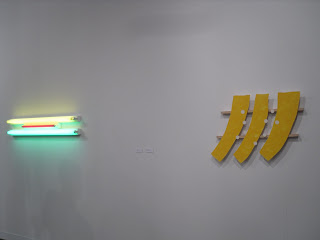
From Aqua, I grabbed an iced tripio and walked back over to main fair at the where I paid $36 for no reason but for an overcrowded convention floor with pieces I’ve seen at MoMA or other major galleries in New York. There were a few highlights, such as a corner where Dan Flavin and Richard Tuttle shared a small space or a small $300,000 neon eye-poke by Bruce Nauman at very pretentious www.donaldyoung.com from Chicago. 


Other highlights includes:
-        the first non-light sculptural piece I’ve seen by Doug Aitken at all-time fav www.regenprojects.com out of LA

-        A Rubens Mano video piece
-        Historic photograph from Marina Abromonvic’s “breathing in, breathing out”

-     Died for Draset and Elmgreen’s sculptural piece called “wash your hands” – only $30,000 at another pretentious gallery - www.massimodecarlo.it from Milan
-        Philippe Parreno’s Blue Candles at http://www.estherschipper.com/ from Berlin

-        Allora and Calzadilla’s gas pump

-        Bruce Weber pictures that included portraits of Dash Snow and Louise Bourgeois


-     Spencer Finch at http://www.nordenhake.com/ from Berlin had a great light sculpture (although I am loving his work at the Corcoran more)


Another highlight that was surprising to find at the main fair was Linder at www.modernart.net from London. Clearly, he is obsessed with nudity and sexuality – his photographs at the gallery combining pornography and desserts, was an interesting and I found comical connection. Chocolate is often referred to as a fill-in for sex, but I can’t I’ve ever seen anyone display the connection so brashly. I also don’t know why I picked up the card for www.tonkonow.com out of Chelsea, but they had some nice works – especially Laurel Nakadate who has some interesting photographs.


From there I decided to go Verge, which was VERY small this year. The fair usually takes over the entire first floor of one of the Catalina buildings, but this year, was under 50%. And the galleries are always up and coming, but this year felt more amateur. It was great though to see some of the artists manning the spaces and I think moving forward it would be a great marketing strategy to highlight the rarity of that at ABMB. I did pick up a small, very affordable piece by www.mikereynolds.us from the artist himself.  From there I decide to hit Nada as I heard good things about it from multiple people. This was the second year that Nada decided to show at 67th and Collins, which is very off the beaten bath for Basel. Plus, the parking around the hotel sucks and there is always a ton of traffic . As a New Yorker, I don’t expect parking, except when you are forced to get to a fair by auto and the venue offers no parking. So I took my chances and parked at the Rite Aid parking lot where huge signs warned of towing. Needless to say, I lasted about 10 minutes in the fair before fear got the best of me and I ran back to the car. I would pay for the valet parking, but for the past two years it was full. So, needless to say, I don’t have any reviews from that show – but running through the whole thing in10 minutes, nothing really jumped out at me – again a regret for not booking a longer trip.

By now it was 6pm - I refreshed (aka showered since I'd be up since 4am), grabbed dinner with a friend and headed to the Fountain party downtown. I immediately felt like I was transported to Third Ward, a collective artists space in a gigantic warehouse in industrial Bushwick. The galleries were filled with art, everything from royal cartoon portraits to artists on swings from the ceilings. Some of the highlights were a space you had to walk through and looked like the aftermath of a raging party. The interpretation of Hope with a six-pack of Pabst, a collective from Brooklyn  (www.we-are-familia.com) included a traditional children’s wooden desk covered in carvings that were all Facebook statuses the artists found online. A bubble boy world in the middle of the ocean, pictures by David S Allee at www.morganlehmangallery.com from Williamsburg of subway cars being dumped into the ocean, and finally drawings of pornographic acts on doilies. The free booze kept us there longer than we needed to be, although I was hoping to see a performance piece that was happening at 11pm in the yard, the friends I was with were more 9th Avenue than Bedford.

Saturday morning I was awoken way too early by my friend’s housekeeper, we were out the door by 9am, drove over to Big Pink for a “cold” outdoor brunch and then headed to Wynwood. At Scope, I was disappointed to see some of the same works from last year, including Aidrian King’s illuminated books and Cecilia Paredes‘s updated photographs  (wrapping her models in fabric instead of the normal body paint I’ve seen previously). There were some great photographs – both of landscapes and of people. There was only one Sanchez Brothers picture this year. However there was a great video section at Pulse and I died for the Omer Fast piece, I almost couldn’t leave the space – it was intoxicating (clip below). Also, was great to see familiar yet still disturbing video pieces by Michael Wolf and new photographs of vacant and depressing American landscapes by Brian Ulrich at www.kochgallery.com from San Francisco. I was also surprised to find myself totally intoxicated by Mary Henderson’s photographic-quality drawings of youth beside a lake. There was something really moving in her work. Miles Aldrich had bright and beautiful Stepford wives in the grocery store. Hugo Lugo’s drawings of men in suits avoiding the rain on oversized lined paper were another highlight. There was also a lot of play with mirrors throughout the fairs - although I can't find the artist names of some of the great pieces below. At Paci Arte, Michal Macku created a fantastic silhouette of a man with an almost eerie light pouring out of his chest, a trend I found runs through most of his work. Korean artist, Miru Kim had a fantastic photograph titled “NY1” with a single naked man on all fours among a few dozen pigs. Also, Jackson Fine Art was there from Atlanta with some great photographic/video pieces by Joseph Guay. This is a gallery I came across over the summer, when I fell in love with David Hillard’s photographs - www.jacksonfineart.com. Another interesting piece and a character was www.agnizotis.com, who showed at Pulse (I think) and had a video work she created last year. The piece was shot at Aqua’s downtown location during a blackout and focuses on a “prominent” art critic masturbating on a work of art in front of a cheering crowd. Definitely said a lot about the art world and the mentality at some of the Miami fairs. 


I forget where I came across Julia Fullerton-Batten’s haunting photograph, but it was very well conceived (at www.randallscottprojects.com from DC). A dated high school gym locker room, filled with judgmental tweens all in beige one-piece bathing suits, staring at the one girl who got her period all over the floor.

From there we drove over to the Midtown area to hit Art Miami, Scope and Red Dot. Honestly, I barely remember these fairs – the main problem with waking up at 4am and going strong for 20 hours. The highlight was the shared booth by Roberta’s and Blue Bottle Coffee at Scope. These are two Williamsburg (or Bushwick, depending on who you ask) institutions, and I was excited to get amazing coffee. Finally, same as last year, one of the last things I saw were three new Saultianos. Last year’s deep red paintings completely woke me up when I was glazed over and half asleep. This year’s vacant, clean pencil drawings were so pure and simple they did the same thing. I wouldn’t have loved them as much if I didn’t know his work to be exclusively red. My favorite, not shockingly, was the drawing of two men in a very intoxicating and inquisitive position that left me wanting to know more. If I had the $30,000, it would have come home with me without question.

We wrapped up around 5pm and I thought about going back over to the beach to see Design Miami or maybe back to Nada – I had a few hours until my flight. Ultimately, I am sad to say, I was too tired to keep going and took my 30-year-old ass to the airport where I spent the extra hour in the AA lounge looking over some of the Art Newspapers from the week. I spent Sunday in bed recovering – the whole day.

In the end, although I saw a lot of the same pieces and a lot of New York galleries, it was still an amazing experience. This was my fourth ABMB and the fact that I saw such a wide range of art in different mediums and price points is still fantastic. This trip sealed the deal that I will continue to make this annual trip down and next year will definitely book four days as to take it all in.