We're back from holiday on Jan 1 and are already planning a big day out Saturday the 7th. Covering three boros and starting at 11am and ending by 7pm.
Were starting out in Brooklyn at the Brooklyn Museum for HIDE/SEEK: Difference and Desire in American Portraiture
www.brooklynmuseum.org/exhibitions/hide_seek/
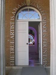
Then heading to the LES to see how the crowds interact with the works at Carsten Holler at the New Museum.
Then we're off to Chelsea, the line-up includes:
David Eliis at @JLGallery http://vimeo.com/20693741
Alex Webb: The Suffering of Light @aperturefnd
Rona Yefman at Derek Eller Gallery
Dark Christmas at leokoenig.com – group show with luminous artists
Cloud Gate group show at monyarowegallery.com
Enrico Castellani at haunchofvenison.com
Cities and Things That Matter at lombard-freid.com
The Birdwatchers Group Show at bitforms.com
Sopheap Pich at trfineart.com
“The Syphilis of Sisyphus,” by Mary Reid Kelley at Fredericks & Freiser
And hope to end the day in LIC with Jim Henson @MovingImageNYC www.movingimage.us/exhibitions/2011/07/16/detail/jim-hensons-fantastic-world
Monday, December 26, 2011
Saturday, December 10, 2011
Art Basel Miami Beach 2011 - The Main Fair
With the ambitious plans to hit 17 fairs and 9 parties, I am ashamed to say I only made it to 7 fairs and 5 parties. Here was day one -
Friday
I needed to hit the convention center (where the actual Art Basel Miami Beach fair is held) on Friday before the weekend hit and the locals over take the place. I didn’t arrive until 3:45 but paid the $40 rather than wait 15 minutes and pay $28 as I knew I needed those 15 minutes and would make them count - and I did. The place was a mob scene – I couldn’t believe how crowded it was. It reminded me of Vernissage at the Armory Show – just packed! I quickly started through, like a mouse in a maze searching for that piece of cheese. I made sure I took note as the isles are lettered A – G, so I didn’t get lost or waste any time. Honestly, a lot of the work I saw was unimpressive. Great if you don’t live in major city or get out to the galleries on a normal basis, but if you are a super artfag like me, you’ve seen most of the works at the main fair. A couple of hits were-
Kerry James Marshall, who I fell in love with at the Art Institute in Chicago, created a great pop-like, yet very dark, acryclic work titled “Black Star” from this year. A great work – I lived for the saggy boobs.
Susanne Vielmetter’s gallery from LA had a lot of works by Michalene Thomas, who I used to love, but when you find out her assistants are the ones gluing the rhinestones on the wood panel, it takes away from the work and makes it less special and more commercial. Although, I am sure a lot of major artists have to do this to keep up with demand for their work once they blow up. There were four of Michalene's works in the booth and three were already sold.


I was shocked to see a Doug Aitken light-box text piece with no picture. It was a very welcomed departure from his other text works as with this work the viewer had to think internally of their associations with 1980. I think I loved it because it was the year I was born.

This work, which was a tapestry, is even more beautiful in the photograph than in reality as the smoke rinks are more defined than you could tell in the convention center. It was an oversized piece and the detail was amazing. It was an Italian gallery, but the artists name wasn't listed anywhere and the gallery women weren't giving me the time of day.


This photograph by Sharon Lockhart seemed to be very of-the-moment. The piece was a clear, almost overstated, observation of financial despair and hope. The expressions were amazing.

Richard Jackson had the one piece that really made me laugh. Titled "Complementary Colors Face-to-Face", the sculptural piece was two dogs that faced each other and literally pissed their color on one another. I didn’t actually see the work in action, but it was amazing as is.


Elmgreen & Dragset’s full "Amigos" installation was in place at Galería Helga de Alvear. It was great to see the work, but it didn’t really work in the space and most people passing by were stopping just long enough to take pictures – I don’t think many of them “got” the work. It was a modern adaptation of bath house - I am sure the gays got it. They were also selling bath towels for $200. I passed.


Chen Xiaoyun’s photograph was another great work that pulled me into the gallery's booth. The scale of the human body next to the large influx of what appeared to be earth or coal was amazing.


The highlight though from the main fair was Wolfgang Tillman’s “Schulterblatt (a)”. The work was very simple, it reminded me of Bruce Nauman’s “Bound to Fail”. The Tillman work was great – the way the sunlight and the shadows highlighted the muscles and contours of the back and arms was really beautiful.

The AP (artists proof) of Nauman's Bound to Fail was at the main fair too, yours for $300,000. At first I assumed the elevated price was attributed to the rarity of an AP. Then I realized the price didn't make any sense to me as I just saw a larger AP of the same work sold last year at Phillips for $108,000. Confused? me too.

The AP (artists proof) of Nauman's Bound to Fail was at the main fair too, yours for $300,000. At first I assumed the elevated price was attributed to the rarity of an AP. Then I realized the price didn't make any sense to me as I just saw a larger AP of the same work sold last year at Phillips for $108,000. Confused? me too.
Finally, Glen Rubsamen’s “It is decided to say nothing” from 2006 was a gorgeously conceived diptych. The complementary colors of green and blue separated a landscape scene from a man-made elevated freeway complete with lampposts and devoid of any trees from a natural world of an encroaching forest. The problem was you didn’t know if it was man encroaching on the forest or the other way around.


We also made it to Art Now at the Catalina Hotel. It was a very small collection of artists and galleries showing. All I can really say is I am happy I didn't have to pay to get in.
The big disappointment was not making it to the Aqua or Verge art fairs. I also didn't make it to the Art Positions portion of Art Basel Miami Beach - an area on the beach that is associated with the main fair. Up next is the satellite fairs I did make it to...
The big disappointment was not making it to the Aqua or Verge art fairs. I also didn't make it to the Art Positions portion of Art Basel Miami Beach - an area on the beach that is associated with the main fair. Up next is the satellite fairs I did make it to...
Thursday, November 24, 2011
I heart Los Angeles
When asked why I love Los Angeles, I have a new answer....
"this is the city in which Bruce Nauman once famously turned his body into a sculpture, Ron Athey first used piercing and onstage bloodletting as part of his artwork, and Chris Burden once had himself nailed to the hood of a car" -Guy Trebay for the New York Times
The full article on MOCA's 2011 Benefit Gala can be found here
Saturday, November 12, 2011
Chelsea Late Fall 2011 - Part One
Trying to hit 32 galleries in one day was somewhat ambitious even for me but here is where we got and what we thought part one -
AJ Fosik and Josh Keyes at www.jonathanlevinegallery.com
Both these exhibitions were great. We went to see AJ Fosik's beautiful fairytale monsters but really fell in love with Josh Keyes drawings and paintings in his "Migration" exhibition. And we weren't the only ones as every work by Josh had sold. The paintings were wild animals that normally wouldn't be together, hanging out in the urban jungle. The works were engaging and comical and beautifully conceived.


Cedric Christie at www.flowersgalleries.com
For this sculptural exhibition, Christie created whimsical sculptures that created effervescent 3D scribbly lines. I was excited to see these works, but was most taken by two works that stood out from the rest made with billards balls. The one was very Donald Judd-inspired - two long black metal rods sandwiched about 12 different colored balls. The piece was very simple, yet striking in its visual impact.
Carsten Holler at www.carolinanitsch.com
I wasn't expecting much from this show. Holler is also on view at the New Museum - having installed a enclosed slide that cuts through the museum. This show was a collection of photogravure (which is to my understanding a complex way to make editions from an artist's proof - more info can be found here) of birds and mushrooms. The bird prints were simply amazing. The artist allegedly crossbred birds to make new species and the result is fascinating. Not only is the work a dialogue about human nature and our ability to breed new species (my mind immediately went to labradoodles, etc) but some of these new birds are adorably photogenic. The show iss small and simple enough not to take itself too seriously.

Nan Goldin and Charles Ray at www.matthewmarks.com
Marks is hosting three art world darlings right now. In addition to Goldin and Ray, in his third gallery are photographs by the late artist Peter Hujar. We didn't make it to 24th Street for these photographs but the show is up until Christmas so hopefully we'll make it back. The Nan Goldin exhibition was amazing and it was my cohort's first experience with her work and he was totally taken with the sheer power of her photographs. If it wasn't for his reaction, I would have lasted three minutes in this gallery. While I am a fan of Goldin's work and always appreciate the emotion in her photographs, I was disappointed in the way these works were displayed. Some of the works were one piece with a grouping of 8 - 16 photographs and while they worked to tell a story or a theme, they style of the grouping reminded me of a high school girl's bedroom pin-board. I felt as a grouping they detracted from the power of the individual photograph.
The Charles Ray exhibit was just one sculptural piece - a shoe that morphed into a mushroom-like head with a money bag on one side. For an artists I usually love, I was not getting this piece and the absence of a press release coupled with a gallerist on the phone left me clueless.
Andrew Borowiec at www.sashawolf.com
"Along the Ohio" is a collection of black-and-white photographs from the 1980s and 1990s of the Midwest landscape. The collection includes both profiles of structrues - homes, gas stations, carports - as well as landscapes both of valleys and flooded streets. The style of the pictures and the absence of any people gave the photos a more historical feel - say mid 1950s. The photos are a mix of both the obvious that hit you over the head and simple landscapes that are beautiful in their simplicity. The obvious came in "Moscow, Ohio 1997" showing a classic Americana backyard, complete with lawn ornamentation, and in the background a large nuclear power plant pumping out smoke. The simple came with the raw beauty in the urban decay landscapes such as "West Market Street, Akron, Ohio, 1985 #1" showing a long abandoned building with weeds making their way through the cement. Mother Earth's fuck you to man's alleged advancement.


Cedric Christie at www.flowersgalleries.com
For this sculptural exhibition, Christie created whimsical sculptures that created effervescent 3D scribbly lines. I was excited to see these works, but was most taken by two works that stood out from the rest made with billards balls. The one was very Donald Judd-inspired - two long black metal rods sandwiched about 12 different colored balls. The piece was very simple, yet striking in its visual impact.
Marcos Zimmermann at www.hpgrpgallery.com
This show was a collection of all black and white photographs of nudes, all men, in South America. It was a solid start to the day but I didn't feel the raw exposure of these men really made the point. It felt more exploitive than engaging.
I wasn't expecting much from this show. Holler is also on view at the New Museum - having installed a enclosed slide that cuts through the museum. This show was a collection of photogravure (which is to my understanding a complex way to make editions from an artist's proof - more info can be found here) of birds and mushrooms. The bird prints were simply amazing. The artist allegedly crossbred birds to make new species and the result is fascinating. Not only is the work a dialogue about human nature and our ability to breed new species (my mind immediately went to labradoodles, etc) but some of these new birds are adorably photogenic. The show iss small and simple enough not to take itself too seriously.

Nan Goldin and Charles Ray at www.matthewmarks.com
Marks is hosting three art world darlings right now. In addition to Goldin and Ray, in his third gallery are photographs by the late artist Peter Hujar. We didn't make it to 24th Street for these photographs but the show is up until Christmas so hopefully we'll make it back. The Nan Goldin exhibition was amazing and it was my cohort's first experience with her work and he was totally taken with the sheer power of her photographs. If it wasn't for his reaction, I would have lasted three minutes in this gallery. While I am a fan of Goldin's work and always appreciate the emotion in her photographs, I was disappointed in the way these works were displayed. Some of the works were one piece with a grouping of 8 - 16 photographs and while they worked to tell a story or a theme, they style of the grouping reminded me of a high school girl's bedroom pin-board. I felt as a grouping they detracted from the power of the individual photograph.
The Charles Ray exhibit was just one sculptural piece - a shoe that morphed into a mushroom-like head with a money bag on one side. For an artists I usually love, I was not getting this piece and the absence of a press release coupled with a gallerist on the phone left me clueless.
Andrew Borowiec at www.sashawolf.com
"Along the Ohio" is a collection of black-and-white photographs from the 1980s and 1990s of the Midwest landscape. The collection includes both profiles of structrues - homes, gas stations, carports - as well as landscapes both of valleys and flooded streets. The style of the pictures and the absence of any people gave the photos a more historical feel - say mid 1950s. The photos are a mix of both the obvious that hit you over the head and simple landscapes that are beautiful in their simplicity. The obvious came in "Moscow, Ohio 1997" showing a classic Americana backyard, complete with lawn ornamentation, and in the background a large nuclear power plant pumping out smoke. The simple came with the raw beauty in the urban decay landscapes such as "West Market Street, Akron, Ohio, 1985 #1" showing a long abandoned building with weeds making their way through the cement. Mother Earth's fuck you to man's alleged advancement.

Another favorite from Sasha Wolf was this piece part of a group show. Still tracking down the artist info.

Friday, November 11, 2011
Tomorrow's Chelsea Line up - only 32 galleries to hit
Skylight Gallery 538 W 29th Street – might be interesting
Sasha Wolf 548 W 28th Street – interesting photos of Midwest landscape
Sean Kelly 528 W 29th Street – very minimal works
AC Institute 547 W 27th Street 6th Floor – I don’t know what this is but I am very curious
The Painting Center 547 West 27th Street 5th Floor – landscape paintings
J Cacciola 617 West 27th Street – interesting oil on board paintings
Paul Kasmin 293 Tenth Avenue – large-scale watercolor paintings of animals
Derek Eller 615 West 27th Street – small show of two major works coupled with a lot of smaller original drawings
Sputnik 547 West 27th Street – photos of gymnast and acrobats
Lelong 528 West 26th Street – Yoko Ono – looks questionable
Magnanvetz 521 West 26th Street – interesting photos, not 100% sold
Salomon 526 West 26th #519 – fun sexual paintings
Marlborough 545 West 25th Street – dying for this exhibition
Winston Wachter 530 West 25th Street – interesting paintings
Henoch – 555 West 25th Street – beautiful realistic paintings of bathers/swimming
1500 511 West 25th Street #607 – photos of real people in Brazil
Leila Heller 568 West 25th Street – gayish photos
Galdstone – 515 West 24th Street and 530 West 21st Street – a disco ball installation?
Benrimon 514 West 24th Street 2nd Floor – lattice-work sculptures
Nicole Klagsbrun 526 West 26th Street # 213 – 37 min performance part of Performa. Start times: 2:00, 2:37, 3:14, 3:51, 4:43, 5:20, 5:57, 6:34, 7:18
Fredericks & Freiser 536 West 24th Street– creepy black & white paintings
Danese 535 West 24th Street – more landscapes
Matthew Marks – go to all 3: 523 West 24th Street, 502 West 22nd Street and 522 West 22nd Street
Danziger 527 West 23rd Street – more animal photos
Carolina Nitsch 534 West 22nd Street - Carsten Holler – also at New Museum right now
Casey Kaplan 525 West 21st Street – basic sculptural works
Flowers 529 West 20th Street – whimsical sculptures
Jonathan Levine – 529 West 20th Street – wild works, not sure what to expect
Hpgrp – 529 West 20th Street 2W – photography
Thursday, October 27, 2011
Upcoming Schedule
I know I've been falling behind in the updates. We've had a busy fall and are hitting all we can at pacific standard time tomorrow before racing back to New York for the Tuesday opening of performa '11.
http://www.pacificstandardtime.org/
http://11.performa-arts.org/
For pacific standard time, I'm only hitting the major museum exhibitions as there is time crunch. Our top three are Moca Geffen, LACMA and Hammer.
http://www.moca.org/black_sun/
http://www.lacma.org/art/exhibition/californiadesign
http://hammer.ucla.edu/
In addition, I will try to squeeze in a stop at Bergamot Station as its a center for galleries that we've never been to. http://bergamotstation.com/visit.php
Since I'm spending the weekend in the OC, we'll also take the opportunity to explore lagunaartmuseum.org as well as ocma.net/
And before you know it, we'll be on the red eye home landing tuesday morning and literally right into performa. Very excited for a long overdue fill of elmgreen and dragset. Both their opening performance on the 1st followed by a very special artist class on Saturday November 5th.
In the mean time we've seen some amazing works in Chelsea and fell back in love with nick cave.
I've been tweeting updates on the great works I've seen and will continue to do so.
twitter.com/PendulumArtNews
Monday, September 26, 2011
Midtown Gallery Visits
Upcoming gallery tours this week:
Gabriel Orozco at Marian Goodman
24 West 57th Street
Luis Gispert at Mary Boone
745 Fifth Avenue
Ad Reinhardt at Pace
32 East 57th Street
Group Show at fordProject
57 West 57th Street
Gabriel Orozco at Marian Goodman
24 West 57th Street
Red Grooms at Marlborough
40 West 57th Street
Luis Gispert at Mary Boone
745 Fifth Avenue
Ad Reinhardt at Pace
32 East 57th Street
Group Show at fordProject
57 West 57th Street
Saturday, September 24, 2011
PST
Where is my trust fund? I need to make to Los Angeles, if only for two days for Pacific Standard Time...
I know this video has received some negative commentary - but its Ed Ruscha - is there any other living man who more fully defines Southern California art? And I say man because Catherine Opie has been heavily involved in this initiative as well.
I know this video has received some negative commentary - but its Ed Ruscha - is there any other living man who more fully defines Southern California art? And I say man because Catherine Opie has been heavily involved in this initiative as well.
Friday, September 23, 2011
Saturday Line Up - West Chelsea
Zwirner 519 W 19
Zwirner 533 W 19
Gladstone 530 W 21
Paula Cooper 534 W 21
Haunch 550 W 21
303 Gallery 547 W 21
Andrew Kreps 525 W 22
Pace 545 W 22
Mallick Williams 150 11th Ave
Gladstone 515 W 24
Marianne Boesky 509 W 24
Andrea Rosen 525 W 24
Lyons Wier 542 W 24
Pace 534 W 25
Lehmann Maupin 540 W 26
Mitchell-Innes + Nash 534 W 26
David Nolan 527 W 29
Sean Kelly 528 W 29
If we can make it to Hudson Square....
Gavin Brown 620Greenwich
Zwirner 533 W 19
Gladstone 530 W 21
Paula Cooper 534 W 21
Haunch 550 W 21
303 Gallery 547 W 21
Andrew Kreps 525 W 22
Pace 545 W 22
Mallick Williams 150 11th Ave
Gladstone 515 W 24
Marianne Boesky 509 W 24
Andrea Rosen 525 W 24
Lyons Wier 542 W 24
Pace 534 W 25
Lehmann Maupin 540 W 26
Mitchell-Innes + Nash 534 W 26
David Nolan 527 W 29
Sean Kelly 528 W 29
If we can make it to Hudson Square....
Gavin Brown 620
And we are definitely trying to make it to the LES....
Creative Time @ Essex Street Market
Creative Time @ Essex Street Market
Tuesday, September 6, 2011
Gallery 31 at the Corcoran
Maybe the best part of the Corcoran was Gallery 31 (http://www.corcoran.edu/exhibitions-events/view/upcoming/transformers). The group show was made up of 15 Corcoran alumni that graduated between 2002 and 2010. I cannot find the specific artists for each piece anywhere, but a list of artist included can be found through the link above.


The Corcoran
Highlights from the permanent collection of the Corcoran - still our favorite institution in Washington

Robert Mangold, Five Color Frame Painting

Kerry James Marshall, Voyager 2009

Neil Jenney, Coat and Coated 1970

Bruce Nauman
Chris Martin : Big Painting


LES Gallery Openings - Tomorrow
The definites -
Hannes Kater at Number 35 141 Attorney
Hannes Kater at Number 35 141 Attorney
Leah Yerpe at Dacia 53 Stanton
Loren Munk at Lesley Heller 54 Orchard
Group Show at Lesley Heller 54 Orchard
Ry Rocklen at Untitled 30 Orchard
Seher Shah at Scaramouche 52 Orchard
Vered Sivan at Rooster 190 Orchard
Zipora Fried at On Stellar Rays 133 Orchard
The Maybes -
Lisa Kirk at Invisible 14A Orchard
Dev Harlan at Christopher Henry 127 Elizabeth
David Kramer at Mulherin + Pollard Freeman Alley
Christina Hejtmanek at Blackston 29C Ludlow
DC Part 1
On our recent trip to Washington DC we found a lot of exhibitions closed, so most of the work on view was part of permanent collections. The stand-out of the weekend was James Turrell at the hirshhorn


We love Turrell, but I couldn't bear the visual transition into complete darkness to allow my eyes to adjust in order to fully experience and appreciate the piece.
More updates throughout the day of our museum visits...
Thursday, August 25, 2011
If you find yourself in Chelsea tomorrow, hit this exhibitions before they close...
Pace 545 W 22
Paula Cooper 534 W 21 (highly recommended)
Tyler Rollins 529 W 20
Yancey Richardson 535 W 22 3rd Flr
Julie Saul 535 W 22 6 Flr
Eliazabeth Dee 545 W 20
Elga Wimmer 526 W 26 #310
Robert Mann 210 11th Flr 10
PPOW 535 W 22 Flr 3
Calvin Morris 210 11th Flr 2
Chair & the Maiden 500 W 22
Claire Oliver 513 W 26
Josh Liner 548 W 28 Flr 3 (slowly becoming a new fav)
HPGRP 529 W 20 #2W
Jon Levine 529 W 20 #9E
Skylight 538 W 29
Mike Weiss 520 W 24
Sunday, June 19, 2011
May 2011 Gallery Overview
In true New York fashion, we set out for the galleries at 3pm on a Saturday after a boozy brunch. Out of the 22 I wanted to hit, we covered 16 in just over two hours. Some, like Gagosian, we only stayed at for one minute and others only had a few works on display (Salomon and Witzenhausen) while others had us lingering.
Live from Detroit at Fred Torres was one that grabbed our attention (www.fredtorres.com/exhibition-space/2011-04-14_live-from-detroit/). It was the first stop of the day and one of the highlights. In fact, things went progressively down hill from here. Not because the art got bad, but because the pretentious gallery girls who were giving you non-stop attitude, were out in full force. More on that later… This group show had some really interesting works mixed in with some banal pieces. The highlights for me were Leon Johnson’s large dining room table with benches instead of traditional arm chairs. The table was set with heavy bowls with the sides almost cut out and custom-made bent spoons. The bowls were set in what looked like concrete rectangles with the bottom of the bowl a clean, simple Robin’s egg blue plaster. It was a great juxtaposition between the roughness of the block with the smooth tactile bowl. Also at the table were large decanters, some of which were half-filled with a red liquid.
I also loved Susan Gothel Campbell’s diptych video installation, although I only really loved one of the videos. That video was capturing the movement of the clouds over the city sprawl of Detroit at a very rapid speed. The camera was positioned just perfectly under the clouds to give a unique sense of space and a new perspective on the landscape.
From there, we ran across the street to see Chris Marker at Peter Blum
(www.peterblumgallery.com/exhibitions/2011/passengers). These images were all shots on Parisian buses or subway cars and caught various passengers either off-guard, in the middle of their cross-word puzzle or just trying to avoid the camera completely. This show was interesting and some of the subjects were giving you a lot, but overall, it seemed like something anyone could do with an iPhone in any major city. It didn’t really speak to the population of the City, the diversity of race or class. It left me feeling uninspired. So we ran over to see Mapplethorp at Foley Gallery (http://www.foleygallery.com/). There were some great portraits captured in this series. Celebs included Patti Smith and Susan Sarandon (with child), a well-know male genital photograph was also featured. This show was interesting in that the gallery "invited fifty people, one from each state in the Union, to select a single artwork from over 2,000 images in Mapplethorpe’s oeuvre that resonated with them personally. While some participants may have already been familiar with Mapplethorpe’s work, some were not. Each image included in the exhibition is accompanied by a text that explains why the participant who selected it found it to be meaningful". It was extremely interesting to see what each person chose and their personal background and to invent in your own (prejudice) mind what drove them to the image they selected.

Leon Johnson at Fred Torres

Chris Marker at Peter Blum

Chris Marker at Peter Blum

Chris Marker at Peter Blum

Chris Marker at Peter Blum

Mapplethorp at Foley

Mapplethorp at Foley
Up next was Cleon Peterson at Joshua Liner (www.joshualinergallery.com), the most disturbing, dark, tormented show we saw all day and therefore (obviously) my favorite. These paintings made with acrylic and spray-paint and only made in black, white and a very unique red. The red color was not a more obviously blood red, but a fluorescent color, more poppy and bright, yet in the context of the works showing massacre and chaos, any fun feelings from this color were squashed and replaced with horror and fear. The Los Angles-based artist is known for his depictions of violence and depravity. The attackers are all in the shadows and all dressed in briefs with little to no features or distinguishable traits. As the press release points out, the attackers show no emotion or rage, while their victims portray the agonizing horror and pain of the attack. The bf liked the work, but he reached a point where we had to leave, I keep exploring the pieces to find the story, the explanation, what had happened. I think that’s why I liked these works, you couldn’t answer those questions – the answer was not there and you had to leave with your own ideas and prejudices of why these attacks were happening.
From there we hit 27th Street to see Harma Heikens at Witzenhausen (http://www.witzenhausengallery.nl/exhibition_detail.php?idxEvent=299). This show was surprisingly small – only six works in total. I don’t have much to say about this show. The sculptures were interesting in their child-like features with adult behaviors. The way she created them yielded a toy-like feel to these dolls, they were characters. According to the press release, the main sculpture in this show was “aileen wuornos, a hitchhiking prostitute who killed seven customers in florida between 1989 and 1990 and was convicted and sentenced to death for six of the murders she was executed via lethal injection in 2002. heikens depicts aileen wuornos age thirteen and pregnant, consistent with the facts.” This makes the work much more interesting, but I would have skipped it due to our typical time constraints and it was our only stop on 27th Street.

Cleon Peterson at Joshua Liner

Cleon Peterson at Joshua Liner

Cleon Peterson at Joshua Liner

Cleon Peterson at Joshua Liner

Harma Heikens at Witzenhausen
Next we hit up EV Day at Salomon (www.salomoncontemporary.com) only to find one piece from her collection at Lincoln Center where she suspended costumes from the ceiling of the Koch Theater. The piece, titled Butterfly, “composed primarily of a ceremonial wedding kimono worn by Cio-Cio San in the Opera's productions of Madama Butterfly from the 1940s through the 1980s, is Day's response to the tragic story”. I never made it to see these pieces at Lincoln Center so it was great to see one piece up close and it was beautifully conceived. It was worth the stop, but wish I could have seen it with the other costumes she created in this series.
We popped into Lyons Wier to see Mary Henderson’s Bathers series, which I first saw in Miami and was obsessed with (www.lyonswiergallery.com). I am not sure what took me about her paintings, which the gallery calls “hyper-real sociological oil paintings”. Her subject matter is very familiar to anyone who traveled for summer weekends. I think it is the familiarity of the scene that brings me back to adolescent, not that I went to a lake house or had the body of any the men in her paintings. The works are great but it too was a smaller show. I would appreciate a larger exhibition of this work, but will take a chance to see these works in any exhibition.
Obviously, I am still living for Luhring Augustine, so we had to stop by to see Martin Kipperberger, who I know I’ve seen elsewhere, but cannot remember where (www.luhringaugustine.com). The works were weird. They included multiple sculptures, including one of a manaquin-like figure in a Jazzy which was based on the artist himself. I need to head back to spend some time there and to understand the pieces. There is a level of movement to the works, but the gallery chose to discontinue this element after 5pm - not sure why, seemed pretentious.
Dark, dark, dark! The Kara Walker show was so dark! (www.sikkemajenkinsco.com) I know this artist is known for portraying disturbing works that talk about race and gender relations, especially in historical context. Often she approaches the difficult realities of slavery in the US. Her work has been very well regarded and received. I find a lot of her work to be inspiring and moving. However, these works are more in you face and very offensive. The press release talks about the works as a "narrative, as if they are telling the story of the African American identity out of the rural oppression and into a more promising life in the city". I didn’t find anything promising in these works and maybe that was her point. The gallery points out the “flucuation of identity” that is constant throughout the works. That is clear as some of the works are text on canvas and the one captured below reads “eternally displaced persons”. I hope in a press release you get some more insight into the works and the artist’s mindset and inspiration. I feel we only get a hint of what is really going on. I fear maybe these works are too dark for the market and I wonder if the gallery is holding back as it may hurt the sale of the work to really talk about what the artist is really portraying. I hope not but I cannot find explanation for the darkness in these works from an artist who usually gives you uncomfortable realities in a painfully subtle way, almost sugar-coated. The works she is best known for are cut-out shadows that tell more stories the longer you engage with the piece. These charcoal drawings are very literal and basically hitting you over the head – what is more literal than text on a canvas?
Demisch Danant is a new gallery for me, they specialize in twentieth century European design with an emphasis on the late 1950s through the 1980s. The current show is Philippon and Lecoq (www.demischdanant.com). The pair was active in the 1950s and 1960s and the works on display are definitely giving you an avant-garde approach to mid-century modern. The works were interesting from a curatorial standpoint. The chairs at the main desk were the best part. It was a small show and all furniture so it was easily digestible and added a good mix to our tour.

Kara Walker at Sikkema

Philippon and Lecoq at Demisch Danant
For John Chamberlain’s show at Pace, the gallery doesn’t say anything in their press release about the works chosen for this exhibition (www.thepacegallery.com). Maybe the point of the show is a fuck you to Gagosian since it seems odd they would both show Chamberlain the same month and that Pace just ended their representation of the artist last year. The show had some great large works as well as some smaller table-top size sculptures. I would like to find out more about the process of making these works. As Pace points out in their press release, the artist has used other mediums in his work, but these steel works are what he is best known for and the only work I’ve seen first-hand. My introduction to Chamberlain and my favorite work to date is a thin, long, fence-like steel piece that is made out of thin ribbon-like stripes – it is on display at DIA Beacon (http://www.diabeacon.org/sites/main/beacon), but I would love to see it in the country side or in a garden.

Chamberlain at Pace

Chamberlain at Pace
Although the boyfriend did not like these works, I was very excited to see these pieces. The
John Chamberlain show at Gagosian is the easiest review to write, because there is none. We walked into the gallery and I was so personally disgusted by the attitude of both the guards and gallery girls at the front dest that we walked in and literally turned on a dime and walked out. I did not need to give them any ammunition to continue their ostentatious ways, especially when Pace was concurrently showing Chamberlain’s work. (www.gagosian.com/exhibitions/2011-05-05_john-chamberlain)
For the Keith Haring show at Gladstone, I honestly don’t remember what was on the walls because in the middle of the gallery were two enormous glass cases filled with small notebook pages with fun, playful sketches and drawings the artist did on the move. The sketches were somewhat homoerotic, probably half were penises or penis-related, so I am sure that helped the attention-grabbing. The works were really great because they offered a view into the mindset of an artist whose work is so iconic and well known. These simple works were comical and self-explorative. The larger works on the wall were iconic pieces that are classic Haring - maze-like paintings that are at the same time chaotic and refined. There is a clear story in the works, but you have to focus your attention to get it. With our normal time restraints, the smaller, intimate works were easier to digest and a fresh way to look at an influential artist. www.gladstonegallery.com
Sol LeWitt at Paula Cooper (www.paulacoopergallery.com), love, love, love Sol LeWitt. I know its not for everyone but I really love the combination of art, architecture and geometry – it’s simple clean, organized style is always makes me feel like I'm on the graph paper with this drawings.

Sol LeWitt at Paula Cooper

Sol LeWitt at Paula Cooper
We ran up to the second floor to see Foreclosed at The Kitchen (www.thekitchen.org) but it was way too much to take in with the four minutes we had to see the work. The space is very educational and I don’t fully understand their mission and story, but I promise find out because I am very god damn curious.
Donald Judd at David Zwirner (http://www.davidzwirner.com) fierce little boxes from the mastermind of simplicity and austere contemporary design. Again, we rushed through here, but really loved the tactical quality of these specific objects.
And finally, Jasper Johns at Matthew Marks. The front gallery had a collection of amazing casts all with numbers, in order from 0 -9. These pieces were both simple in their message but monumental in their materiality. I can't say much for the works in the back gallery. The impressions (seen below) in the front gallery were pretty amazing, mathematical and almost educational in a very 10 Commandments way. Just fun, impressive works. http://www.matthewmarks.com/exhibitions/2011-05-07_jasper-johns/)

Jasper Johns at Matthew Marks

Jasper Johns at Matthew Marks
Subscribe to:
Posts (Atom)